The Livble Widget (Deprecated)
Learn how to embed the Livble widget within your tenant portal
This Guide is DeprecatedThe following guide applies to a deprecated version of the Livble SDK.
For up-to-date documentation on the latest version, click here.
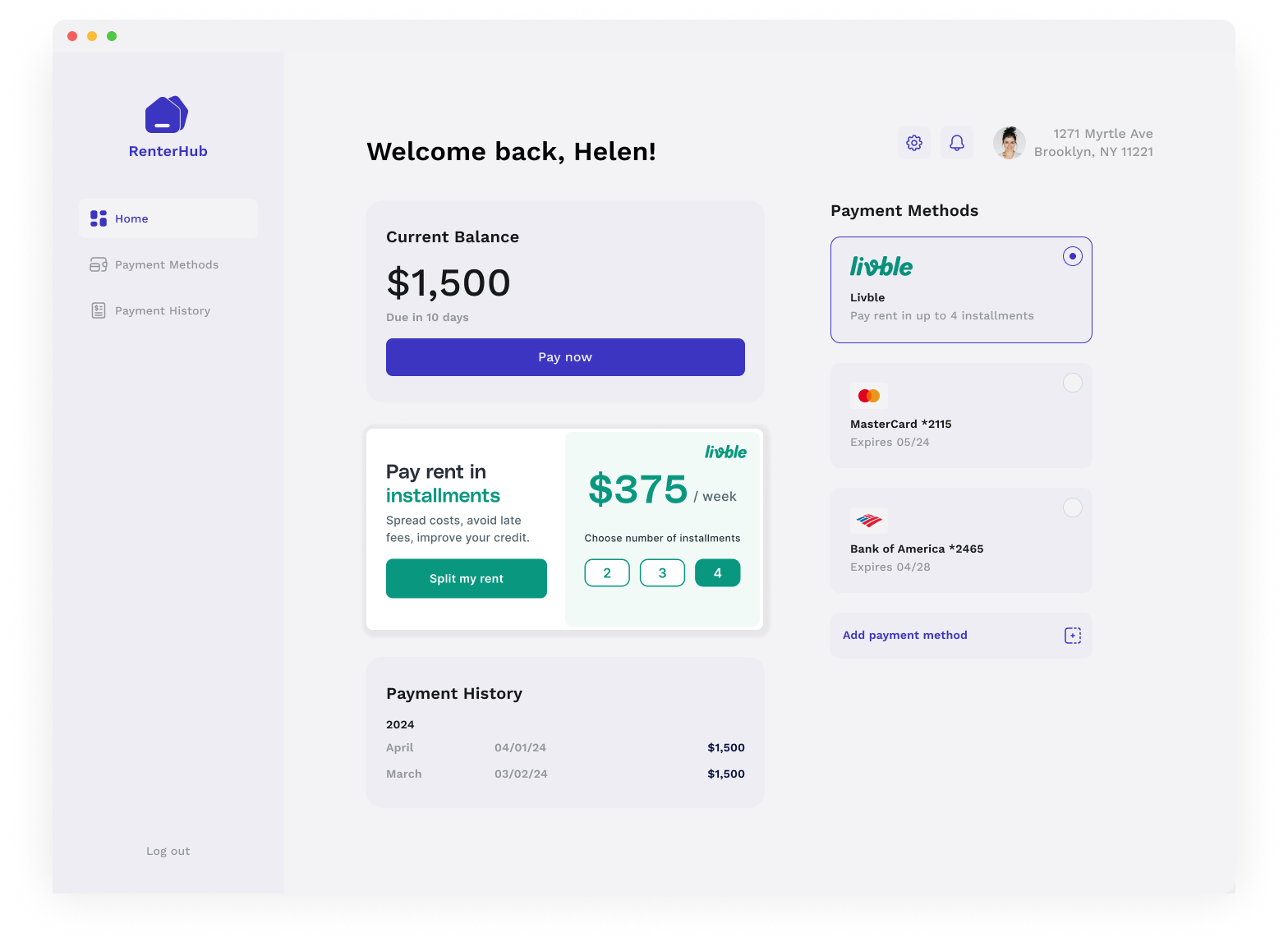
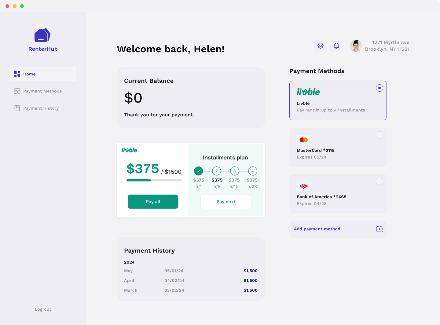
What is the Livble Widget?
The Livble Widget is a smart embedded asset that can be integrated into your tenant portal. It is aware of the state of the tenant and shows the relevant information and actions based on that. The widget is responsive and will adapt to any layout you decide to use.
Once the Livble Widget is clicked it will automatically pop the Livble experience
Widget size
As mentioned before the widget will adapt its size and layout based on its container.
The only restrictions are:
- Min width: 320px
- Min height: 250px
How to integrate the Livble Widget?
If you use React, we have created a React component that is very easy to use
import { LvbleWidget, LvbleProvider} from "@lvble/react";
import { Environment } from "@lvble/core";


<LvbleProvider environment={Environment.Sandbox} onEvent={onEvent}>
  // The LvbleProvider is positioned somewhere above the LvbleWidget
  // ...
  <LvbleWidget token={token}/>
  // ...
</LvbleProvider>
If you don't use React you get a widget and insert into the DOM yourself
import {Environment, Lvble} from "@lvble/core";

const lvble = Lvble({
     environment: Environment.Sandbox, onEvent:onEvent
    });

// Get Lvble widget
const widget = lvble.createWidget(token: token);

// Insert it in the DOM
document.getElementById("lvble-widget").appendChild(widget);
Widget/Lvble SDK Parameters
| Parameter | What is it? | How to get? |
|---|---|---|
| token | A token needed to prompt the widget. Lives for 1 hour | Call the POST /portal_info or GET /tenants/<id> and retrieve lvble_token from response |